

Understanding the role of UI elements in game design is crucial for developers aiming to create immersive and engaging experiences. A well-designed user interface can significantly enhance gameplay, providing players with intuitive tools to navigate menus, customize characters, and interact with the game world. From simple dropdown menus to complex adaptive systems, the user interface plays a pivotal role in shaping how players engage with the game. As the demand for visually stunning and functionally robust games continues to rise, so does the need for developers to master the art of UI design. Whether it’s streamlining combat systems, optimizing inventory management, or crafting story-driven interfaces, every element contributes to the overall user experience. In this article, we’ll explore the essential UI components that every game developer should know, offering insights into how to design effective interfaces that keep players hooked and enhance the gameplay experience.
Key Takeaways
- Buttons are essential for user interactions, such as submitting forms or triggering actions.
- Navigation Bars help users easily explore different sections of an app or website.
- Sliders enable users to adjust settings like volume or brightness seamlessly.
- Icons provide quick visual cues for actions, functions, or branding.
- Dropdown Menus offer filtering or sorting options without cluttering the interface.
- Checkboxes and Radio Buttons allow users to make selections in forms and preferences.
- Tabs organize content into distinct, easily accessible sections.
- Modals provide crucial alerts or actions without interrupting the main flow.
- Virtual Scrollers let users navigate large datasets effortlessly.
- Consistency ensures a cohesive and professional user experience.
- Accessibility features like alt text and keyboard navigation make interfaces inclusive.
- Responsive Design adapts UI elements to various screen sizes seamlessly.
- Visual Hierarchy guides user attention, reducing cognitive load.
- The Five Dimensions of UI—Visual, Functional, Emotional, Behavioral, and Technical—ensure a well-rounded, user-centric design.
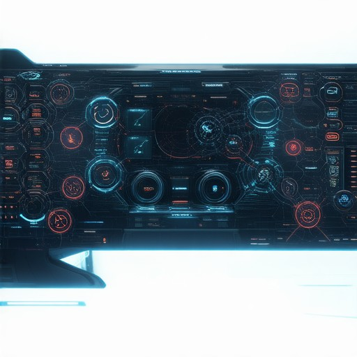
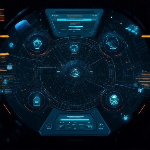
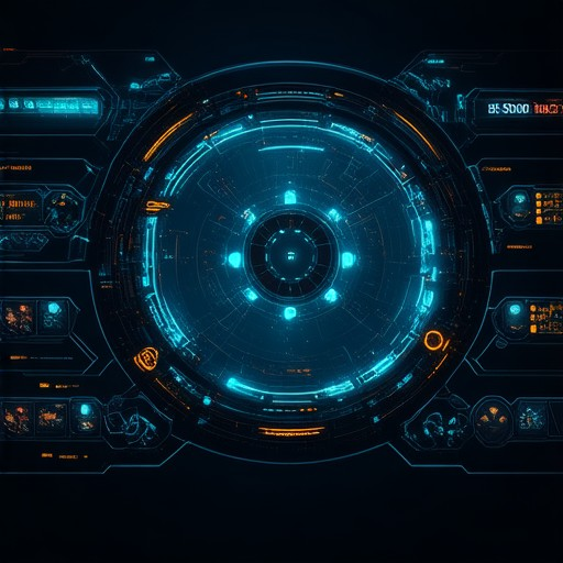
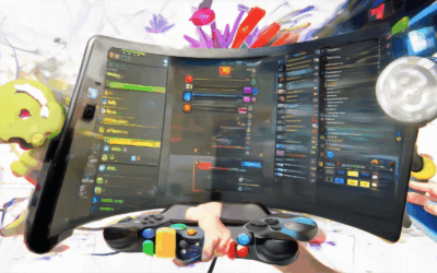
UI Components of a Game
The User Interface (UI) of a game is composed of several essential components that work together to enhance the player’s experience. Here’s a breakdown of the primary UI elements:
- Heads-Up Display (HUD):
- This is typically located at the top of the screen and displays crucial information such as health, mana, ammo, or other vital stats. It provides real-time updates without requiring the player to navigate menus.
- Graphical User Interface (GUI):
- The GUI includes menus, buttons, and windows that allow players to access various game functions like pausing, saving, or viewing the inventory. It serves as the gateway for interactive elements beyond the immediate action.
- Icons:
- Representing objects, abilities, or items, icons are small images that provide quick visual cues. They are often used for weapons, armor, spells, and other game elements, aiding in quick decision-making.
- UI Framework:
- The foundational system that integrates and manages all UI components. It ensures smooth operation and compatibility among different elements, enabling efficient player interaction.
- Status Bar:
- Located at the bottom of the screen, this bar displays additional information such as time, level, quest progress, or notifications. It offers quick access to relevant game stats.
- Tooltips:
- Pop-up boxes that appear when hovering over icons or buttons, providing explanations or descriptions. They assist new players in understanding game mechanics and interfaces.
- Hotspots:
- Interactive areas on the screen that can be clicked, such as buttons or icons, allowing players to perform actions without navigating menus.
These components collectively create an intuitive and visually appealing interface, making games more accessible and enjoyable.
What Are the 4 Types of Game UI?
There are four primary types of game user interfaces (UI), each serving distinct purposes and integrating differently into the gaming experience:
- Non-Diegetic UI
This type of UI is typically displayed separately from the game world, often overlaid on top of the screen. Common examples include heads-up displays (HUDs) that show health, ammo, or other essential info. These interfaces are designed to be easily accessible without disrupting immersion. - Diegetic UI
Diegetic UIs are integrated into the game environment, meaning they appear as part of the game world rather than as a separate overlay. Examples include inventory screens, character sheets, or maps that players access through interactions. This approach enhances immersion by feeling more organic to the gameplay. - Meta UI
Meta UIs provide overarching information about the game without being tied to specific actions or locations. They often summarize stats, achievements, or progress. For example, a pause menu might display saved games or achievements in a non-intrusive manner. - Spatial UI
Spatial UIs use three-dimensional space to present information, often attaching elements like health bars or minimaps to specific characters or objects in the game. This approach creates a more dynamic and interactive interface, enhancing player engagement.
Each of these UI types plays a crucial role in enhancing the player experience, providing necessary information, and immersing users in the game world. By understanding these distinctions, developers can tailor their UI designs to suit specific game objectives and player preferences.
Learn more about UI design principles to optimize your game’s interface.
What Makes a Good Game UI?
A good game UI is essential for providing an optimal user experience, ensuring players can easily navigate and interact with the game. Here are the key factors that define a successful game UI:
- Intuitiveness :
- The UI should be easy to understand and navigate, allowing players to find controls, menus, and features without confusion.
- Consistent design patterns across the game help reduce cognitive load and make the game feel cohesive.
- Visual Appeal :
- A visually appealing UI enhances immersion, drawing players deeper into the game world.
- High-quality graphics, thoughtful color schemes, and well-designed icons contribute to an engaging experience.
- Smooth Performance :
- The UI must load quickly and respond to inputs without lag or delay.
- Optimized rendering and efficient coding ensure the game runs smoothly across different devices.
- Responsive Design :
- The UI should adapt to various screen sizes, ensuring compatibility with consoles, PCs, and mobile devices.
- Flexible layouts allow the game to look great on any display.
- Feedback Mechanisms :
- Clear visual and auditory cues indicate interactions, such as button clicks or menu selections.
- These feedback loops make the game feel more dynamic and responsive.
- Accessibility :
- The UI should accommodate players with disabilities, offering options like adjustable font sizes, contrast settings, and keyboard shortcuts.
- Inclusive design ensures the game can be enjoyed by a diverse audience.
- Themed Consistency :
- The UI design should align with the game’s theme, whether it’s a futuristic sci-fi setting or a medieval fantasy world.
- Consistent styling reinforces the game’s atmosphere and immersion.
- Social Features Integration :
- UI elements that support social interaction, such as leaderboards, friends lists, and achievement notifications, enhance community engagement.
- Clear indicators of progress and achievements motivate players to continue exploring the game.
- Performance Optimization :
- The UI should be lightweight to prevent bottlenecking the game’s performance.
- Efficient rendering techniques and optimized code ensure smooth operation.
By focusing on these elements, developers can create a game UI that not only looks great but also enriches the overall gameplay experience.

What are the elements of UI?
User Interface (UI) elements are the building blocks that create interactive experiences for users. These components allow users to engage with digital products like websites, apps, and software. Below is a breakdown of essential UI elements:
Common UI Elements
- Buttons: Used to trigger actions like clicks, submissions, or navigation. Examples include “Submit,” “Add,” and “Search” buttons.
- Navigation Bars: Provide access to different sections or features of an app or website. Commonly found at the top of screens.
- Menu Items: Links or options within a menu that allow users to select actions or view content.
- Checkboxes: Allow users to toggle between selecting or deselecting options, often used in forms or preference settings.
- Radio Buttons: Enable users to select one option from a group, typically used in surveys or preferences.
- Dropdown Menus: Hides additional options that appear when the user clicks on a button or arrow. Commonly used for filtering or sorting.
- Scrollbars: Allow users to navigate through long lists or content, enabling vertical scrolling.
- Progress Bars: Visual indicators showing the completion status of tasks, like loading percentages or task progress.
- Tabs: Organize content into distinct sections, allowing users to switch between views with a single click.
- Sliders: Adjust values or settings along a continuum, commonly used for volume control or brightness adjustments.
- Form Fields: Input fields for text, dates, email addresses, and numbers, enabling user interactions and data entry.
- Icons: Small graphical elements that represent actions, functions, or brands, providing visual cues to enhance usability.
- Tooltips: Pop-up boxes that display additional information when hovering over an object, helping users understand function or context.
Advanced UI Elements
- Accordion Menus: collapsible sections that fold down to reveal additional content, useful for saving space and organizing information.
- Carousel Sliders: Rotateable collections of images or cards that allow users to browse items one at a time.
- Rating Systems: Interfaces that allow users to rate or evaluate products, services, or content on a scale.
- Chips or Badges: Small UI elements displaying tags or achievements, often used for categorization or status indicators.
- Modals: Overlays that appear on top of the main content, used for important alerts, confirmations, or additional actions.
- Notifications: Small messages alerting users to events, updates, or changes, typically found in the corner of the screen.
- Virtual Scrollers: Allow users to scroll through large datasets or content without leaving the current view.
Best Practices for UI Design
- Consistency: Maintain uniformity in design elements, colors, fonts, and spacing to create a cohesive user experience.
- Accessibility: Ensure UI elements are usable by everyone, including those with disabilities, by incorporating features like alt text and keyboard navigation.
- Responsive Design: Make UI elements adapt to different screen sizes and devices to ensure seamless interaction across platforms.
- Visual Hierarchy: Arrange elements in order of importance to guide user attention and reduce cognitive load.
Key Elements of UI Design
The User Interface (UI) is the visual part of a software application that allows users to interact with it. Here are the essential elements of a good UI:
- Buttons : These are the most common interactive elements. They can be categorized into primary (e.g., “Submit”), secondary (e.g., “Cancel”), and tertiary buttons (e.g., “Help”) for different types of interactions.
- Inputs : Text boxes, checkboxes, radio buttons, and dropdowns allow users to enter or select data. Examples include search bars, form fields, and filtering options.
- Navigation : Elements like menus, tabs, and sidebars help users move through the app. Common examples include top navigation bars, left-hand sidebars, and bottom navigation tabs.
- Menus : Dropdown menus, context menus, and collapsible menus provide options for users to access features or functions.
- Tooltips : Small pop-up windows that display additional information when users hover over an element or icon.
- Icons : Simple images that represent actions, objects, or concepts, making the interface more intuitive.
- Micro-interactions : Brief animations or feedback mechanisms that occur when users perform actions, like clicking a button or hovering over an element.
- Visual Hierarchy : The arrangement of elements in terms of size, color, and placement to guide the user’s attention and reduce cognitive load.
- Consistency : Ensuring that elements look and behave the same way across the interface for a cohesive user experience.
- Accessibility : Designing elements to be usable by everyone, including those with disabilities, through features like keyboard navigation and screen readers.
- Spacing and Layout : Proper alignment, padding, and margins create a clean and organized interface that is easier to navigate.
By incorporating these elements thoughtfully, designers can create interfaces that are not only functional but also enjoyable and easy to use. For more resources on UI design, check out our tutorials and blogs .
The Five Dimensions of UI
The User Interface (UI) design is a multifaceted field that considers several key aspects to create an effective and engaging user experience. Below are the five primary dimensions of UI:
- Visual Dimension :
This involves the aesthetic elements of the interface, such as color schemes, typography, spacing, and button designs. A visually appealing and consistent UI enhances user satisfaction and brand recognition. - Functional Dimension :
Focuses on how the interface functions, ensuring it is intuitive and easy to navigate. Key aspects include feature availability, navigation pathways, and usability, which directly impact user productivity. - Emotional Dimension :
Relates to the overall feel and atmosphere of the interface. It encompasses the user experience, aiming to create a positive, intuitive, and pleasurable interaction that resonates emotionally with users. - Behavioral Dimension :
Analyzes user behavior patterns, such as how users interact with the interface, their typical actions, and how they adapt to changes. This dimension helps tailor the UI to align with user needs and preferences. - Technical Dimension :
Involves the underlying systems and technologies supporting the UI, such as frameworks, coding languages, and APIs. This ensures the interface operates smoothly and efficiently.
By integrating these five dimensions, a well-designed UI not only meets functional requirements but also creates a cohesive, engaging, and user-centric experience.

0 Comments